As a nonprofit, securing donations is critical to your mission and impact. However, creating an effective donation landing page can be challenging and time-consuming without technical skills. You need a simple yet powerful solution to build a high-converting page quickly. With Unicorn Platform, a no-code website and blog builder, you can design a custom donation landing page in minutes without any coding required.
If you're interested in learning more about how Unicorn Platform can help with nonprofit website development, check out our article on Unicorn Platform Makes Nonprofit Website Development Easy.
What Is a Donation Landing Page?
A donation landing page is a webpage dedicated to raising money for a specific cause or charity. It makes it easy for visitors to learn about your mission and donate to your organization. Creating an effective donation landing page is key to maximizing your fundraising efforts.
An effective donation landing page should:
- Clearly state your mission and purpose. Explain who you are and what you aim to achieve to connect with your audience. Use visuals like photos and videos to help bring your cause to life.
- Share your story. Help visitors understand the problem you are trying to solve by sharing real stories about the people you have helped. Personal stories from beneficiaries of your charity are especially impactful.
- Offer different donation amounts. Provide options at various price points so people can donate an amount that suits their budget. Having pre-set amounts, e.g. $25, $50, $100 also makes it easy for people to choose.
- Explain how funds will be used. Be transparent about how you will allocate donations. Tell visitors exactly what their money will support, e.g. providing meals, building schools, protecting wildlife. This helps build trust in your organization.
- Provide security badges. Include logos of trusted third-party services like PayPal, Stripe or Braintree to reassure visitors their financial information will be safe. This can help overcome objections to donating online.
- Make it easy to share. Add social media share buttons so visitors can spread the word about your cause to friends and family. When others see them donating to your charity, it may inspire them to donate as well.
- Thank your donors. Express gratitude for people's generosity and support. Send an email thanking them for their donation and share the impact of their gift. This makes them feel good about donating to your charity.
In summary, an effective donation landing page educates visitors, inspires them to take action, and facilitates the donation process. By optimizing your page, you can raise more money for your important cause.
Why You Need a Donation Landing Page
As a nonprofit, securing donations is critical to your mission and success. An effective donation landing page is key to converting visitors into donors. Here are a few reasons why you need a dedicated landing page for your fundraising campaigns:
- Focus the visitor on one call to action. A landing page with a single goal, like encouraging the visitor to donate or sign up as a sponsor, is more effective than a general website page. Remove any distractions and make the desired action obvious.
- Share your story. Use visuals and copy to convey your nonprofit’s purpose, key initiatives, impact, and beneficiaries. Personal stories and statistics about those you serve are especially compelling. Appeal to the emotions and values of your audience.
- Offer giving options. Provide choices at different donation levels. Some may prefer to give a small, one-time gift while others may want to become monthly donors or sponsors at a higher level. Give donors the flexibility to choose what suits their needs and means.
- Make it easy to complete the transaction. Include an embedded donation form on the page that allows donors to input payment details directly. The fewer steps required, the more likely visitors are to follow through. Offer a range of payment methods to accommodate different preferences.
- Follow up appropriately. Once someone donates, the relationship has just begun. Send a thank you email with a receipt for their records. Continue to provide updates on how their gift made an impact and opportunities to give again in the future. Steward your donors well and they will become long-term supporters.
A custom donation landing page, focused on your mission and tailored to your audience, is invaluable for any nonprofit looking to gain momentum and build a base of recurring donors. Put in the effort to craft a compelling page and you'll see the rewards in a growing, sustainable source of funding for your organization.

How to Build a Donation Landing Page
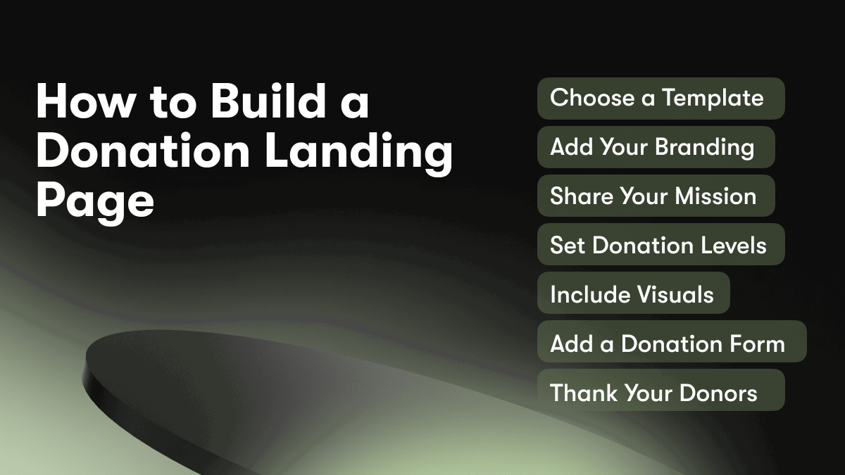
To build an effective donation landing page using Unicorn Platform, follow these steps:
Choose a Template
Select a template that is optimized for accepting donations or selling a product. Some good options include:
- Charity/Non-Profit Template: Includes sections for your mission, donation levels, and a donation form.
- Crowdfunding Template: Great for raising money for a new product, event, or creative project. Includes story section, budget, updates, and pledge levels.
Add Your Branding
Make sure to add your organization's logo, brand colors, and fonts to give your page a customized, professional look. You can upload your logo in the "Branding" section.
Share Your Mission
Use the large header section at the top of the page to briefly share your organization's mission and purpose for raising funds. Explain how donations will be used and the impact they will have.
Set Donation Levels
In the "Pricing" or "Donation Levels" section, set specific donation amounts at varying levels, e.g. $25, $50, $100, $500. For each level, describe the benefits or impact of donating at that amount. Offer additional perks or rewards when possible.
Include Visuals
Add images and videos throughout your page to help bring your mission and purpose to life. Images of the people who will benefit from donations are especially powerful. You can upload your own images or choose from thousands of free stock photos in the Unicorn Platform media library.
Add a Donation Form
Include a donation form, like a payment button, donate now button or full payment form where supporters can enter their payment information to make a one-time or recurring donation. Be sure to include fields for name, email, billing address, credit card number, expiration date, and CVV.
Thank Your Donors
Once a donation is made, be sure to thank the donor for their generous support. Send an email thanking them for the specific donation amount. Let them know the impact their gift will have. Building personal connections and relationships with donors will increase the likelihood of repeat and ongoing support.
Donation Landing Page Examples
To maximize donations, it is imperative to have an effective landing page. Below are a few examples of well-designed donation landing pages to inspire your own creation.
Charity: Water
Charity: Water’s donation page immediately engages visitors with a bold photo and simple ask: “Give clean water to people in need.” They outline a clear call-to-action to “Donate now” and provide suggested amounts (e.g. $30, $75, $150) to prime visitors. The page reinforces the impact of donations through statistics and stories of lives changed.
St. Jude Children’s Research Hospital
St. Jude’s landing page pulls at the heartstrings by focusing on the children they serve. Large photos of patients are accompanied by their stories. The call-to-action “Donate now to help kids like Kaylee” is a powerful motivator. They also provide options to donate in honor of a patient, in memory of a loved one, or as a tribute.
The Nature Conservancy
The Nature Conservancy’s clean, minimalist page highlights beautiful nature photos to elicit an emotional connection. They convey the urgency of environmental challenges and how donations can help. Options to give monthly or annually in addition to one-time gifts are offered. The impact of donations is emphasized through specific examples of what different amounts can achieve.
Additional Considerations
Some other effective strategies for a donation landing page include:
- Offering matched donations or other incentives to spur giving.
- Providing a fundraising progress bar to create a sense of momentum.
- Giving donors the option to cover transaction fees so that 100% of their gift goes to the cause.
- Optimizing the page for mobile devices since many donors now give via smartphones.
- Including engaging visuals like bold photos, infographics, charts or graphs to bring the cause to life.
- Offering donors a free gift or token of appreciation for their generosity.
By examining these examples and recommendations, you can construct a winning donation landing page that motivates visitors to become dedicated supporters of your cause. With the right message and presentation, you'll be raising funds for your organization in no time.

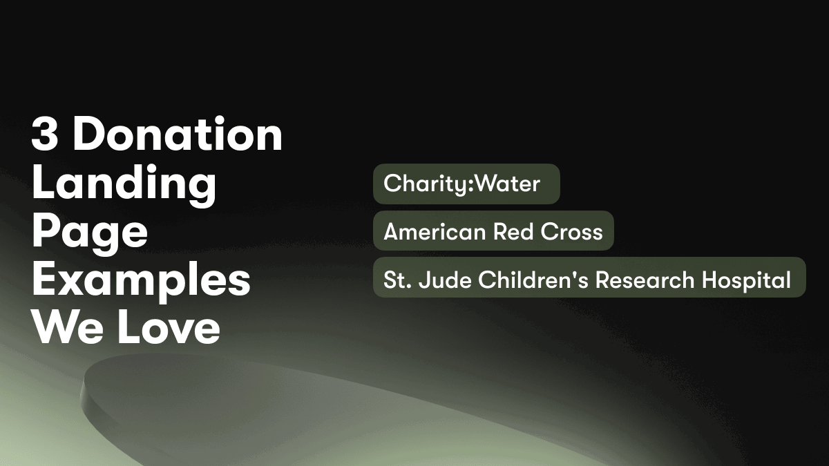
3 Donation Landing Page Examples We Love
When creating a donation landing page, studying examples from other organizations can help inspire your own design. Below are three donation landing pages we love:
Charity:Water
Charity:Water's donation page features a bold photo of people accessing clean water, with a simple message: "100% of your donations go directly to water projects. We prove every dollar." The page outlines the impact of different donation amounts, from $30 providing one person with clean water to $10,000 supporting an entire village. The clean layout and compelling copy make a strong case for the importance of each donation.
American Red Cross
The American Red Cross donation page uses eye-catching graphics and statistics to highlight the impact of donations. For example, "$8 can provide one blanket, $25 can provide one cleanup kit, $125 can provide one cot for shelter." The page also features donor stories and a live fundraising tracker to increase urgency. Overall, the Red Cross page does an excellent job of conveying the immense impact donors can have during disasters.
St. Jude Children's Research Hospital
St. Jude's donation page pulls at the heartstrings by focusing on the children they serve. A video features patient stories and interviews with families to build an emotional connection with visitors. The page is simple but impactful, asking donors to commit to a monthly gift to provide treatment and care for children with cancer and other life-threatening illnesses. By putting the human impact of donations front and center, St. Jude's page is extremely effective.
In summary, some best practices for donation landing pages include: using visuals to strengthen your message; breaking down the impact of different donation amounts; featuring real stories from those you serve; employing a simple and uncluttered design; and conveying the urgency or importance of donations. By following these examples, you can craft an engaging donation page for your own organization.
The Anatomy of a High-Converting Donation Landing Page
To maximize donations, you need an effective landing page. The anatomy of a high-converting donation page includes:
A Compelling Headline
Your headline should convey the importance of your cause and move readers to take action. For example, “Give the Gift of Hope: Make a Difference in a Child’s Life Today.”
An Emotional Opening Paragraph
Share a story that tugs at the heartstrings and helps supporters connect with your mission. For instance, “For children living in poverty, something as simple as a new book or toy can make a world of difference. Your gift today will bring joy and encouragement to a child in need.”
An Explanation of Need
Educate visitors about the specific need or cause their donation will address. Use statistics and facts to demonstrate the urgency and scope. For example, “Over 13 million children in the U.S. live in ‘food insecure’ homes. Your donation will provide meals and snacks for children who would otherwise go hungry.”
Clear Calls-to-Action
Place prominent “Donate Now” buttons early and often. Make it easy for visitors to choose a donation amount that suits their budget. For example:
- Donate $25 to provide meals for 1 child for 1 week.
- Donate $50 to provide meals for 2 children for 1 week.
- Donate $100 to provide meals for 4 children for 1 week.
Images of Impact
Embed high-quality photos of people benefiting from donations. Images of smiling children, families, or communities in need will motivate visitors and foster an emotional connection to your cause.
Social Proof
Share testimonials from donors and highlights of your impact and accomplishments. For instance, “Thanks to the generosity of our supporters, we have provided over 1 million meals to food insecure children.” Social proof builds trust and reassures visitors their gifts will be used effectively.
Following the anatomy of an effective donation landing page will enable you to craft a page that inspires action and generosity. You have the power to change lives for the better. Don’t underestimate the impact your page can make.
Choosing the Right Images and Visuals for Your Donation Landing Page
Images of People
Include photos of people who have benefitted from your organization’s work. Show a diverse range of ages, ethnicities and abilities to connect with more potential donors. Have them smile, make eye contact with the camera and appear genuinely happy. These types of images help to make an emotional connection and highlight your impact.
Infographics
Infographics are an excellent way to convey key information, statistics and facts about your cause in an easy to understand visual format. Create infographics highlighting things like how donations are used, challenges you aim to address or accomplishments over the years. Keep the designs simple with minimal text and a consistent color scheme.
Videos
Short videos, especially those with a personal story, can be highly effective on donation pages. Capture someone’s experience with your organization and how it has changed their life for the better. Keep videos under 90 seconds for maximum impact without demanding too much of the viewer’s time.
Calls to Action
Include clear calls to action, like “Donate Now” buttons, throughout your page. Place them near impactful images, statistics or videos when emotions are highest. Use a bold color for buttons that stands out from the rest of your page. Tell people exactly what to expect after they click, such as being taken to a secure donation form.
Consistent Branding
Ensure all images, videos, infographics, fonts, and colors used reflect your organization’s brand. This helps to build familiarity and trust with visitors. Use the same logo and color palette that you have on your main website. Keep the style, tone, and message consistent across your whole platform.
An effective donation landing page incorporates impactful and consistent visuals to motivate the viewer. By highlighting accomplishments, sharing personal stories, and conveying key facts through media, you can inspire people to support your important cause. With clear calls to action and branding throughout, you make it easy for visitors to donate and become part of your mission.
Writing Compelling Copy for Your Donation Landing Page
Make Your Headline Count
The headline is the first thing visitors see, so make it compelling. Focus on the key benefit or result, e.g. “Double Your Impact With a Monthly Donation”. Use action-oriented language and speak directly to the reader. Keep headlines under 65 characters for best readability.
Share Your Mission and Vision
Briefly explain your organization’s mission and vision. Discuss the issues you aim to address and who will benefit. Share key achievements and accomplishments to build credibility. Use statistics and facts to strengthen your case, e.g. “We have provided over 1 million meals to families in need since 2010.” Keep this section around 2 short paragraphs.
Explain the Need
Discuss the need or problem that donations will help solve. Provide real examples and stories to make an emotional connection. Explain how donations will be used and the impact, e.g. “Your monthly gift of $25 provides a week of meals for a family.” This section should be 3 to 4 paragraphs.
Offer Donation Options
Give the reader several options at different price points to choose from. For example:
- $10/month: Provides 2 days of meals for a family.
- $25/month: Provides 1 week of meals for a family.
- $50/month: Provides 2 weeks of meals for a family.
- $100/month: Provides 1 month of meals for a family.
Allow the reader to choose a custom amount as well. Provide a donation form immediately below the options to encourage conversion.
Include a Strong Call-to-Action
End with a clear call-to-action, e.g. "Give monthly today and double your impact. Together, we can end hunger in our community." Provide social proof by mentioning other donors or share results and milestones to motivate the reader. Keep your CTA concise, around 2 sentences.
Using these guidelines to craft a compelling message, showcasing visuals to strengthen your case, and providing clear options and a strong CTA can help convert visitors into regular donors. With a monthly sustaining gift, donors can make a big difference and help achieve your mission.
FAQs: Landing Page For Donations and the Unicorn Platform
What are the main features of Unicorn Platform?
Unicorn Platform offers an intuitive drag and drop builder to create donation landing pages in minutes. You have access to designer-made templates, as well as the ability to build from scratch. Some of the key features include:
Pre-designed Templates
Choose from conversion-optimized templates for charity, nonprofit, and crowdfunding campaigns. Simply add your images, content and payment gateway to get started quickly.
Customizable Design
Unicorn Platform provides full design control. You can easily change fonts, colors, spacing and more to match your brand. Add your logo, feature images and pick colors that resonate with your audience.
Integrations
Connect your payment gateway, email marketing service, and analytics platform with just a few clicks. Unicorn Platform integrates with Stripe, PayPal, Mailchimp, Google Analytics, and more.
Analytics
View key metrics like page views, conversion rate, average donation amount and revenue to optimize your landing page. See what's working and make data-driven decisions to improve results.
How much does Unicorn Platform cost?
Unicorn Platform is free to use. We offer paid upgrades with additional features for nonprofits and organizations with high donation volumes. Pricing starts at $29/month.
Do I need any coding experience?
No coding experience is required to build with Unicorn Platform. We provide an intuitive drag and drop builder with designer-made templates to get started quickly, no matter your technical skill level.
How do I connect a payment gateway?
Connecting a payment gateway like Stripe or PayPal only takes a few minutes. Simply go to Integrations in your Unicorn Platform account, select your payment gateway and follow the instructions to obtain your API keys or access credentials. Paste the keys into Unicorn Platform and your donation form will be connected, allowing supporters to donate directly on your landing page.
Conclusion
You've now seen how easy it is to create an effective donation landing page using Unicorn Platform. In just a few minutes, you were able to choose a stylish template, add images and text, include social proof with testimonials, and embed a payment form to start collecting donations right away. The platform's intuitive interface and drag and drop features mean you don't need any technical skills to build a professional page.
With your new landing page live, you can start promoting your cause on social media and via email campaigns to drive more traffic and increase the number of donations. The more people discover your campaign, the bigger impact you can have. Best of all, you can make changes to your page at any time to optimize the content and layout based on the results you're seeing. Unicorn Platform gives nonprofits and charities an simple yet powerful way to raise funds and make a difference.


