As an entrepreneur launching a new SaaS product, you need an effective landing page to capture leads and convey your value proposition. However, building a custom landing page requires technical skills and resources that you may not have access to, especially in the early stages of your startup. Fortunately, there are now no-code solutions that make it possible to create a professional landing page without hiring a developer. For instance, you can use Unicorn Platform's drag-and-drop builder to create a stunning landing page for your SaaS product in minutes, as discussed in their article on how to drag and drop your way to a Tailwind SaaS landing page.
What Is Unicorn Platform?
Unicorn Platform is an intuitive drag and drop website builder that allows you to create professional SaaS landing pages with no coding experience required.
- What You Get: Unicorn Platform provides everything you need to build an effective SaaS landing page. It offers:
- A library of professionally designed page templates to choose from
- An easy to use drag and drop editor so you can customize the template
- High-quality stock images that you can use in your designs
- The ability to add interactive elements like contact forms, CTA buttons, image galleries, pricing tables, and more
- A dashboard to view analytics for your landing pages like page views, conversion rates, and sources of traffic
- Who It's For: Unicorn Platform is ideal for:
- Startups looking to create landing pages to promote their SaaS app
- Mobile app developers wanting an easy way to build landing pages to drive downloads
- Agencies that want to provide landing page design services to clients without needing developer resources
- Anyone with a SaaS or web app that wants to create professional landing pages to generate more leads and customers
- How It Works: Using Unicorn Platform is very straightforward. The basic steps are:
- Select a pre-made landing page template to use as a starting point. You can then customize the template by rearranging sections, changing colors, adding your own images, etc.
- Add interactive elements like contact forms, call to action buttons, pricing tables, image sliders, and more by dragging and dropping them onto your landing page.
- Connect your custom domain or subdomain, if you have one. Or use the Unicorn Platform domain to host your landing page.
- Launch your landing page and start driving traffic to it using social media, search engines, email marketing, and any other channels you use to promote your SaaS or web app.
- View analytics for your landing page in the Unicorn Platform dashboard to see how effective it is at generating leads and customers. Make changes as needed to improve conversion rates.
With Unicorn Platform, you have access to an intuitive drag and drop website builder, high-quality templates and assets, hosting, and analytics - everything you need to create high-converting SaaS landing pages with no coding skills required.
Why You Need a Landing Page for Your SaaS Business
As a SaaS business owner, you need an effective landing page to capture leads and drive conversions. Here are a few reasons why a dedicated landing page is essential for your SaaS company:
- Focus the visitor's attention. A landing page focuses on one goal or call to action, removing distractions. This makes it more likely visitors will convert by signing up for a free trial or demo.
- Capture lead information. An optimized landing page includes a lead capture form to gather contact information from interested visitors. This allows you to nurture leads through email marketing and sales follow-up.
- A/B test different options. By creating multiple landing page versions, you can A/B test elements like headlines, copy, images, and call-to-action buttons to see which ones resonate most with your target audience. This data-driven approach helps maximize conversion rates over time.
- Establish your brand. An attractive, well-designed landing page helps to convey your SaaS brand and the benefits of your solution. The overall experience, from visuals to messaging, gives visitors a sense of your company values and the power of your product.
- Analyze performance. With dedicated landing pages, you can use analytics tools to gain insights into key metrics like pageviews, time on page, bounce rates, and conversion rates. These metrics help determine what's working and what needs improvement to optimize the performance of your landing pages.
- Improve SEO. Optimized landing pages, especially when focused on strategic keywords, help boost your search engine optimization (SEO) by giving search engines more of your content to index. The additional indexed pages also provide more opportunities for people to discover your SaaS business organically.
In summary, a strategically designed landing page is a must-have for any SaaS company looking to generate more leads, drive conversions, establish their brand, and improve SEO. With a data-driven approach to optimization, landing pages can become one of your most powerful marketing tools.

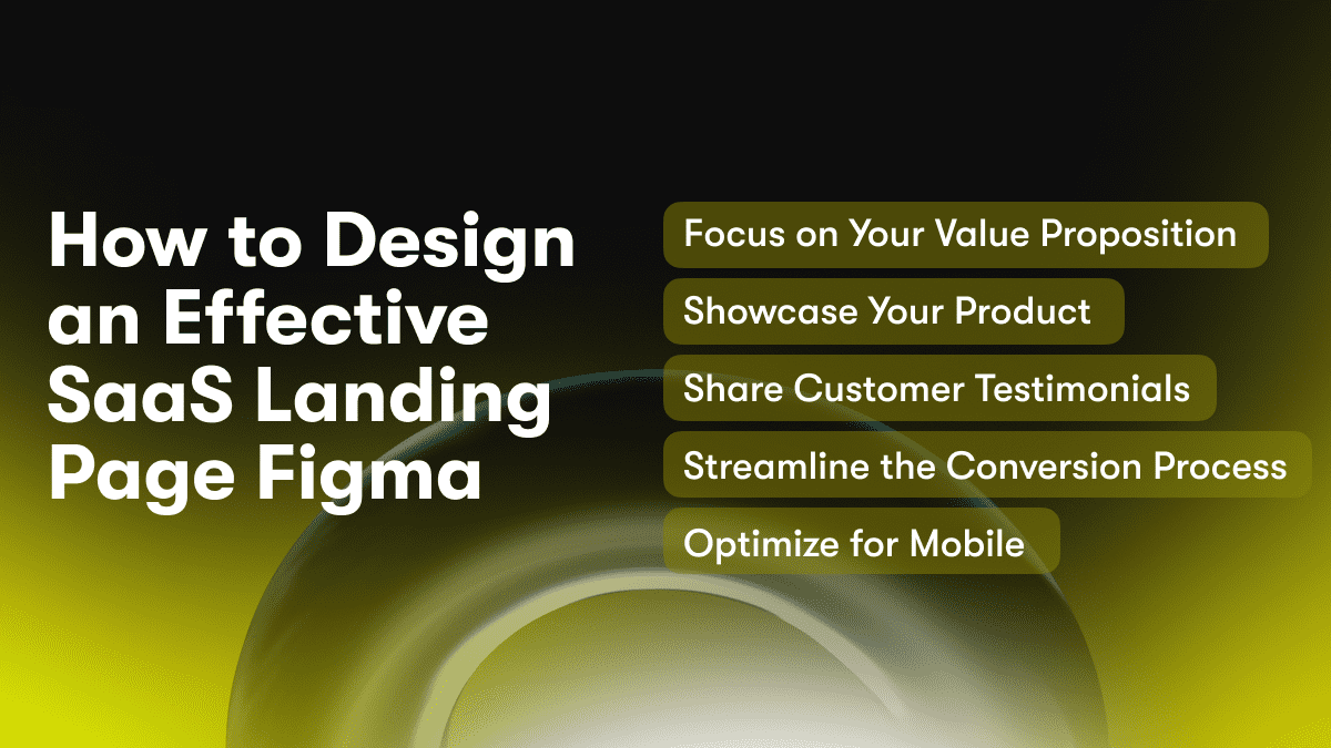
How to Design an Effective SaaS Landing Page Figma
To design an effective SaaS landing page in Figma, there are several key steps to keep in mind:
Focus on Your Value Proposition
Your value proposition should be front and center on the page. Explain exactly what your product or service does and how it benefits customers. Use concise copy and visuals to convey your key differentiators and the problems you solve.
Showcase Your Product
Include images, GIFs or video to demonstrate how your software works. For SaaS, screenshots and screen recordings are particularly effective. Keep these visuals large and eye-catching. They should give visitors an immediate sense of your product experience and interface.
Share Customer Testimonials
Social proof from real customers builds trust and credibility. Include authentic testimonials, reviews, case studies or customer stories on your landing page. Pull quotes from these testimonials to highlight, or link to dedicated case study pages on your site.
Streamline the Conversion Process
Your CTA button should be the most prominent item on the page. Use clear, concise copy to prompt visitors to sign up for a free trial or demo. Remove any friction in the signup process by only asking for essential information like name, email and password. You can gather additional details later in the onboarding flow.
Optimize for Mobile
With more people accessing the web via mobile devices, your landing page must be responsive. Use a mobile-first design approach to ensure all elements scale appropriately for small screens. Keep buttons, forms, and other interactive components easy to tap and engage with on touchscreens.
For further insights on crafting a high-converting landing page with essential elements, check out this article on the Unicorn Platform blog: Craft a High-Converting Landing Page with These 5 Must-Have Elements. By following these best practices, you can craft an attractive yet high-converting landing page for your SaaS product. Keep testing and optimizing to improve results over time. With an effective landing page that clearly articulates your value, you'll attract more quality leads and accelerate growth.
This addition smoothly integrates the link and provides readers with a valuable resource for understanding essential landing page elements, while optimizing the article for SEO.
Top Tips for Optimizing Your Saas Landing Page Figma
To optimize your SaaS landing page in Figma, follow these top tips:
Focus on Benefits Over Features
Prospective customers care more about the benefits and outcomes of your product than the features themselves. Focus your messaging on how your product or service will improve their lives or make their jobs easier. Use emotive language and storytelling to help them visualize success.
Clear Value Proposition
Your value proposition should be front and center, stating exactly how you will provide value to customers. It should be concise yet compelling, highlighting your key differentiators. Place this prominently at the top of your page.
Social Proof
Include testimonials, case studies, reviews, or media mentions from reputable sources. This social proof builds credibility and trust in your brand. Aim for 2 to 3 strong examples.
Strong Call-To-Action
Your CTA should be visually prominent, using contrasting colors. Offer a free trial or demo and keep your form short, requesting only essential information. Provide an incentive for the visitor to take action now.
Mobile-Friendly Design
With more and more web traffic coming from mobile devices, your landing page must be responsive. Use large text, buttons, and empty space. Keep menus, forms, and CTAs above the fold. Test the page load times to ensure a good user experience on all devices.
A/B Test
Continuously optimize your page through A/B testing different elements like copy, images, form fields, and CTAs. Even small changes can lead to significant improvements in conversion rates. Analyze the data to make informed decisions about the most effective designs.
By focusing on these key areas, you will transform your SaaS landing page into a powerful lead generation tool. Paying close attention to the needs and motivations of your target customers, establishing a clear value proposition, incorporating social proof, optimizing for mobile, testing, and continuously improving your page will help maximize your conversions and achieve your growth goals.
How We Built the Unicorn Platform No-Code Builder
Building the Unicorn Platform no-code website builder was no easy feat. Our team of engineers and designers spent over a year developing a drag and drop builder that requires zero coding skills. We focused on three main areas to achieve this:
Simplicity
We designed the Unicorn Platform interface to be as simple and intuitive as possible. All of the elements you need to build a landing page are easily accessible in the left toolbar. You can drag and drop sections like headers, images, buttons and more onto the canvas. Rearranging sections is as easy as clicking and dragging them into place. The UI is clean and minimal so you can focus on designing your page.
Customizability
While the Unicorn Platform is easy to use, it also provides a high degree of customization. You have full control over:
- Fonts: Choose from a variety of Google Fonts to match your brand
- Colors: Select colors from a color wheel or enter hex codes to perfectly match your brand colors
- Section widths: Adjust sections to be full width, half width or quarter width
- Content: Easily add or edit text, images, video, social icons and more
Integrations
Unicorn Platform integrates with many of the tools you already use like Google Fonts, Unsplash and Giphy. This allows you to choose high-quality fonts, images and GIFs without leaving the builder. The Unicorn Platform also generates clean, semantic HTML so your page will rank well in search engines like Google.
By focusing on these three areas, we built a no-code website builder that provides an optimal balance of simplicity and customizability. The Unicorn Platform empowers people to create beautiful, custom landing pages, no coding required. Let us know if you have any other questions!

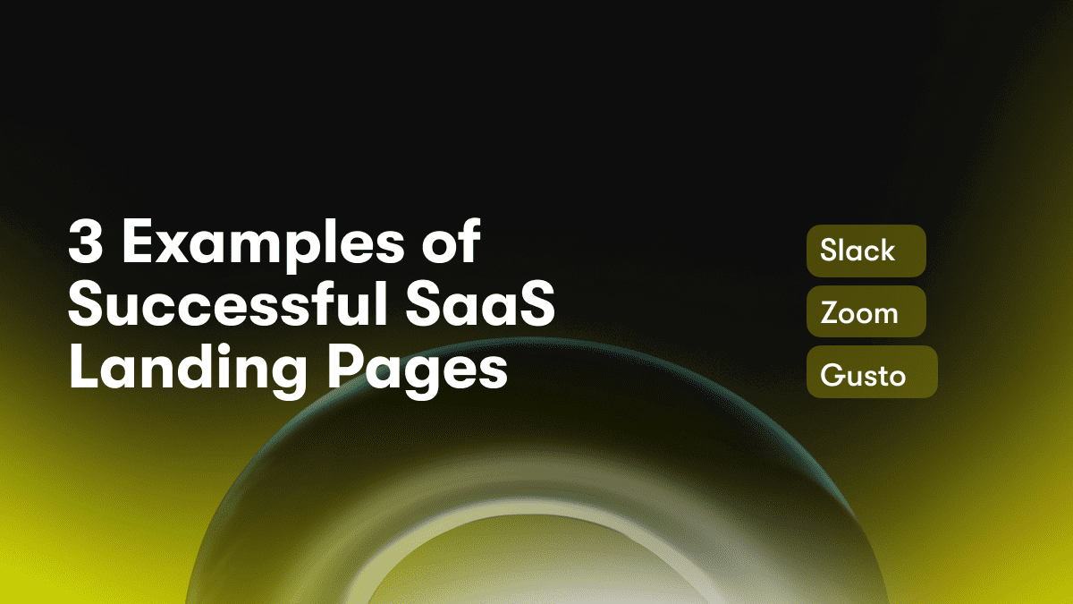
3 Examples of Successful SaaS Landing Pages
To build an effective SaaS landing page, it helps to analyze successful examples for inspiration and ideas. Below are three successful SaaS landing pages and what makes them work:
Slack
Slack’s landing page is clean and simple, focusing on their product’s key benefits. Large text and images highlight features like customizable channels, notifications, and integrations. Testimonials from major companies who use Slack build social proof. A prominent call-to-action asks visitors to “Sign up for free”, keeping the page focused on conversions.
Zoom
Zoom’s landing page conveys their product’s value proposition through bold imagery and text. “Meet Happy” is a clever tagline that promises a better user experience. Feature descriptions are concise but compelling, emphasizing HD video and audio, collaboration tools, and ease of use. The page gives a walkthrough of the product experience to help visitors visualize using the platform. A free trial CTA allows for easy adoption and onboarding.
Gusto
Gusto’s landing page takes a minimal, human-centric approach. Their tagline “Payroll and benefits made easy” is supported by customer stories and reviews. Simple but playful illustrations represent how Gusto helps business owners focus on what really matters. The page focuses on addressing pain points around payroll and benefits through an intuitive, automated platform. A free demo CTA lets visitors experience how “delightfully simple” the product is.
In summary, these successful SaaS landing pages:
- Clearly convey the product’s key benefits and value proposition
- Use visuals and minimal copy to communicate an easy, intuitive user experience
- Build credibility through social proof like customer testimonials and reputable logos
- Have a prominent call-to-action, often for a free trial or demo, to convert visitors
By following these best practices, you can design an effective SaaS landing page that resonates with your target customers and moves them through the conversion funnel. Focus on showing how your product solves their needs in an engaging, compelling way.
How to Create CTAs That Convert
To create effective CTAs (calls-to-action) that drive conversions on your SaaS landing page, there are a few best practices to keep in mind:
Make CTAs Prominent
Place your main CTA front and center on your landing page where visitors can easily see it. Use a bold color and large font size to make it stand out. The CTA should be one of the first things visitors notice when the page loads.
Keep CTAs Above the Fold
Position your primary CTA “above the fold” so visitors don’t have to scroll to see it. The area above the fold refers to the portion of the page that is visible in the browser window when the page first loads, without any scrolling required. CTAs in this area have the highest visibility and conversion rates.
Use Action-Oriented Copy
The CTA copy should motivate the visitor to take action. Use active verbs like “Get Started,” “Sign Up Now,” or “Start Your Free Trial.” Avoid passive phrases like “Click Here” or “Learn More.” Action-oriented copy helps convey the benefit and urgency.
Offer a Strong Value Proposition
Your CTA should make a compelling offer highlighting the key benefits and value your product or service provides to customers. Briefly reiterate your unique selling proposition to give visitors a reason to click.
Keep CTAs Simple and Straightforward
Avoid complicated CTAs with too much text or confusing options. Simple buttons with concise messaging tend to convert the best. Give visitors a clear path forward with one primary CTA on your page.
Test Different CTAs
Continually test variations of your CTAs to determine which copy, design, color, size, and placement resonate most with your visitors and generate the highest click-through and conversion rates. Even small changes can lead to significant improvements.
By following these best practices, the CTAs on your SaaS landing page will become highly optimized conversion machines. Paying close attention to prominence, positioning, copy, value propositions, simplicity, and testing will transform your CTAs into the strongest drivers of action on the page.
A/B Testing Your Landing Page Design
Run A/B tests
To optimize your SaaS landing page, run A/B tests on different elements to see which options generate the most conversions. A/B testing involves creating multiple versions of the same page and testing them with real visitors to determine which one performs better based on the goals you’ve set.
Test page layouts
Try different layouts for your landing page content to find the most effective structure. For example, test having the headline, image and CTA button at the top of the page versus the middle or bottom. Test left sidebar navigation versus top navigation. See which layout drives the most visitors into your sales funnel.
Experiment with copy
Craft multiple versions of your landing page copy, such as the headline, subheadings, bullet points and CTA button text. Test different wording, lengths, tones of voice and styles to find what resonates most with your audience. Even small changes to copy can significantly impact conversions.
Vary visual elements
Make duplicates of your landing page and change the featured image, color scheme or other visual elements. Test the pages to determine which version makes the biggest impression and spurs the most visitors to take action. Images and color palettes that evoke emotion or convey your brand personality may increase conversions.
Analyze and optimize
Once you have statistical data from your A/B tests, analyze which versions of your landing page elements generated the most conversions. Make changes to optimize your page based on the highest-performing options from the tests. Continue running A/B tests regularly to keep improving your landing page and increase customer acquisition. With time and testing, you'll develop a high-converting SaaS landing page.
Using A/B testing to experiment with and optimize your landing page can lead to a major boost in signups and sales. The insights you gain about what resonates with your target customers will help you create a customer experience that fuels business growth.
FAQs: Using Unicorn Platform for Your Appilo App Landing Page
What is Unicorn Platform?
Unicorn Platform is a no-code website and blog builder for startups, mobile apps, and SaaS companies. It enables you to create stunning landing pages, product pages, help centers, and blogs without coding. Everything is drag and drop.
How do I create an app landing page with Unicorn Platform?
To build an app landing page on Unicorn Platform, follow these steps:
- Select the “Landing Page” template to get started. This provides a slick design optimized for app marketing.
- Add visuals like images, GIFs or videos to showcase your app. You can upload your own or choose from Unicorn’s library of stock media.
- Include persuasive copy that highlights the key features and benefits of your app. Discuss how it solves users’ problems or improves their lives. Use subheaders, bullet points and short paragraphs to make the copy scannable.
- Add social proof like customer reviews, testimonials or media logos. This builds credibility and trust in your product.
- Include clear call-to-action (CTA) buttons like “Download now” or “Learn more” that link to your app store listing or company website.
- You can also add an email signup form to start building your mailing list. Offer an incentive like a discount or exclusive content for subscribers.
- Once your landing page is built, you can easily publish and share the link on your website, social media, ads and email marketing campaigns. You can also embed the page on your site using an iframe.
- Use the built-in analytics to see how visitors are engaging with your landing page so you can optimize the content and design to drive more conversions.
What else can I build with Unicorn Platform?
In addition to landing pages, Unicorn Platform can be used to create:
- Product pages to showcase your app features
- Help centers with FAQs, guides and documentation
- Blogs to publish content for your users and SEO
- About pages to tell your startup’s story
- Pricing pages to highlight your app’s plans and costs
- And more...
Unicorn Platform provides everything you need to build a beautiful web presence for your mobile app or SaaS without coding. Give it a try today!
Conclusion
As you have seen, creating an engaging SaaS landing page in Figma is easier than ever. With a few simple clicks, you can build a custom landing page to capture leads and connect with your target customers. The no-code tools available today empower non-designers to create beautiful, high-converting web pages. Whether you want to promote an upcoming product launch or generate more signups for your mailing list, Figma makes it possible to do it yourself. Now that you have the knowledge and skills, start designing your SaaS landing page today. Build something your customers will love.


