As an entrepreneur in the food industry, you know that a stylish yet functional website is crucial for engaging your customers and driving sales. However, building an attractive landing page from scratch requires technical skills and time that you would rather devote to your culinary creations. With the Unicorn Platform, you can quickly design an enticing food landing page to showcase your products and services without needing to code. Check out these landing page examples for restaurants for inspiration and get started on your own landing page today!
Why You Need a Food Landing Page
A dedicated food landing page is essential for any restaurant, cafe or food business today. It allows you to highlight your brand and offerings in an attractive way, helping you stand out in an increasingly crowded market.
First, a custom landing page builds credibility. It shows you are an established, professional business committed to a quality web presence. For food businesses especially, an appealing website with enticing visuals of delicious dishes or a stylish dining space can inspire confidence in potential customers.
Second, it gives you control over your messaging. You can emphasize what makes your business unique, whether it’s a commitment to fresh, organic ingredients, a variety of international cuisines or a fun, family-friendly atmosphere. Share your business’s story and values to connect with your target audience.
Finally, an optimized landing page helps with search engine optimization (SEO). When people search online for places to eat in your area, you want your business to appear at the top of the results. A well-designed landing page, with relevant keywords and a clear menu or product list, signals to search engines that you provide value to users. Over time, as people click through and spend more time on your page, your rankings will improve.
In summary, a custom food landing page is a smart investment that allows you to shape your brand, reach new customers, and improve your visibility online. For a small business, it can have a big payoff through increased interest, reservations, and sales. With an easy-to-use landing page builder, you can have an attractive, high-performing website up and running in no time. Focus on stunning visuals, an enticing menu, and communicating what makes your establishment unique, and you’ll be well on your way to success.
Choose a Template on Unicorn Platform
To build an attractive food landing page in minutes, you'll want to start with a template on Unicorn Platform. With over 100 mobile-optimized templates to choose from, you're sure to find one suited to your needs.
Select a template categorized under “Food & Restaurant”. These provide an ideal starting point for a food-focused landing page. Preview the templates to find one you like with:
- An image-rich design to showcase mouthwatering photos of your fare.
- A prominent call-to-action like “Book a Table” or “View Our Menu” to capture visitors’ interest immediately.
- A text section to highlight your restaurant or catering service’s story and offerings.
Once you choose a template, it’s easy to customize. You can:
- Upload your own photos or choose from Unicorn’s library of free stock images.
- Change the text, fonts, and colors to match your brand.
- Add or remove sections as needed. For example, include a gallery page or contact form.
- Select a theme with the color scheme and style you want. Unicorn has palettes for every taste from minimal to bold.
With the template selected and customized, your stylish landing page is nearly done. Now, just add your business details like name, address, hours, and contact information. You can then publish your page with the click of a button.
In three simple steps—choose a template, customize it, and publish—you’ve created an enticing landing page to showcase your restaurant or catering service on the web. Using Unicorn Platform, crafting a professional page tailored to your needs has never been faster or easier for food industry professionals and entrepreneurs. With an eye-catching page live, you'll start attracting hungry customers in no time!

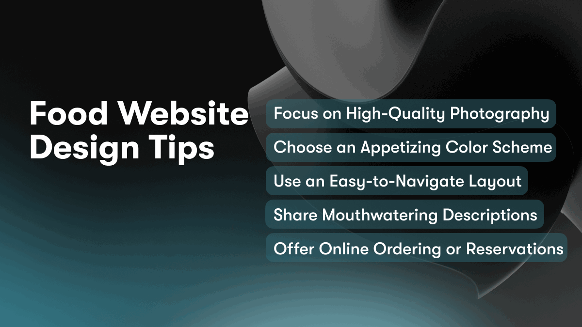
Food Website Design Tips
To design an attractive food website, keep the following tips in mind:
Focus on High-Quality Photography
Professional food photography is key to an appealing food website design. Showcase high-quality photos of each dish or product you offer. Zoom in on ingredients and garnishes. Use natural lighting when possible and style the photos attractively. Include photos from multiple angles, such as an overhead shot looking down on the plate.
Choose an Appetizing Color Scheme
Select colors that evoke appetite and freshness. Shades of red, orange and green are ideal for food websites. You might also incorporate wooden textures or marble patterns. Avoid dull or clinical color schemes. Your color palette should make visitors hungry and eager to try what you’re offering.
Use an Easy-to-Navigate Layout
A simple, uncluttered layout is essential for a food website. Arrange sections in an intuitive order, such as ‘Appetizers,’ ‘Entrees,’ ‘Desserts’ and ‘Drinks.’ Include graphical menus to make navigation effortless. Use plenty of negative space and avoid crowded pages. Your visitors should be focused on the food, not struggling to find what they want.
Share Mouthwatering Descriptions
Write descriptions for each menu item that bring the dish to life. Mention specific ingredients, flavors and cooking techniques. Share how the item looks, smells and tastes. Describe the experience of eating it. This helps visitors visualize the food and builds their anticipation. Keep descriptions concise yet vivid and compelling.
Offer Online Ordering or Reservations
Depending on your business model, allow visitors to order food for delivery or pickup directly through your site. You might also enable online reservations for dine-in guests. This convenience encourages more people to engage with your offerings by making the experience seamless from discovery to consumption.
By focusing on stunning visuals, an appealing esthetic, simple navigation, tantalizing descriptions and convenient online features, you'll craft a food website design that leaves visitors hungry for more. Apply these tips and your site will have visitors salivating in no time.
Share Your Brand Story and Vision on Your Food Landing Page
To build an effective food landing page, share your brand’s story and vision. Help visitors understand your company’s purpose and values.
Describe your brand’s origins and mission. For example, “We started as a small bakery in our home kitchen, dedicated to crafting artisanal breads and pastries with locally-sourced, organic ingredients.” Explain your vision for positively impacting customers or society. For instance, “Our vision is to bring healthy, sustainable food options to communities across the country.”
Highlight your brand’s values and priorities. For example, “We value high-quality, nutritious ingredients, environmental stewardship, and community building.” Share how you embody these values, e.g. “We only use organic, non-GMO, and fair trade certified ingredients in our recipes.” Describe any causes or organizations you support. For example, “A portion of all sales goes to support food access programs in our city.”
Share your brand’s personality and voice. Help visitors understand the experience of interacting with your company. For example, “We believe that good, wholesome food should be an easy, everyday pleasure. Our brand voice is friendly, warm, and unpretentious.” Use messaging and imagery that reinforces your desired brand personality across your landing page.
Tell stories that give life to your brand and connect with visitors on an emotional level. Share how your company has impacted employees, customers or your local community. For instance, “Jenna has been a loyal customer for five years. She says our granola gives her an energy boost to start her busy days as a teacher.” Stories help to build trust and resonance with your audience.
A compelling brand story and vision form the foundation for an impactful food landing page. Be authentic and share what truly matters to your company. Visitors will appreciate learning about the real people and purpose behind your brand. Crafting a genuine connection will turn first-time visitors into lifelong customers and brand advocates.
Highlight Your Products and Services
To attract customers and generate sales, you need to effectively showcase your products and services on your food landing page. Highlight what makes your offerings unique and demonstrate their value.
Describe Your Products in Detail
Write a short paragraph highlighting each of your main products or services. Mention the key features, ingredients, nutrition facts or components that make them special. Use photos to give visitors a visual representation of what you're selling. For example:
Our artisanal sourdough bread is made from only the freshest, all-natural ingredients using a traditional 48-hour fermentation process. Each loaf contains organic stone-ground wheat flour, sea salt, and wild yeast. The long, slow rise gives our bread an unparalleled flavor and texture.
Share Your Customer Benefits
Explain how your products or services will benefit customers. Will they save time, improve health, increase enjoyment or productivity? For example:
Our meal kits contain pre-portioned, locally-sourced ingredients so you can skip the grocery store and cook a homemade dinner in just 30 minutes. Our recipes are dietitian-approved, so you can feel good about feeding your family nutritious, balanced meals.
Offer Free Resources
Provide free resources like recipes, meal plans, or product guides to build trust and demonstrate your expertise. For example:
Download our complimentary healthy lunch recipe ebook with 10 satisfying, waistline-friendly meals you can make in under 15 minutes. We share our secrets for turning simple ingredients into delicious, good-for-you lunches.
Promote Current Discounts or Sales
If you're running any special promotions, feature them prominently on your landing page. For example:
For a limited time, get 20% off your first meal kit delivery. Use code LAUNCH20 at checkout to claim this special introductory offer. Offer ends Friday at midnight, so act now!
An attractive, well-designed landing page that highlights your products, services and current offers in an engaging way will entice visitors and turn them into loyal customers. Carefully crafted content and visuals are key to conveying your brand message and unique value proposition.

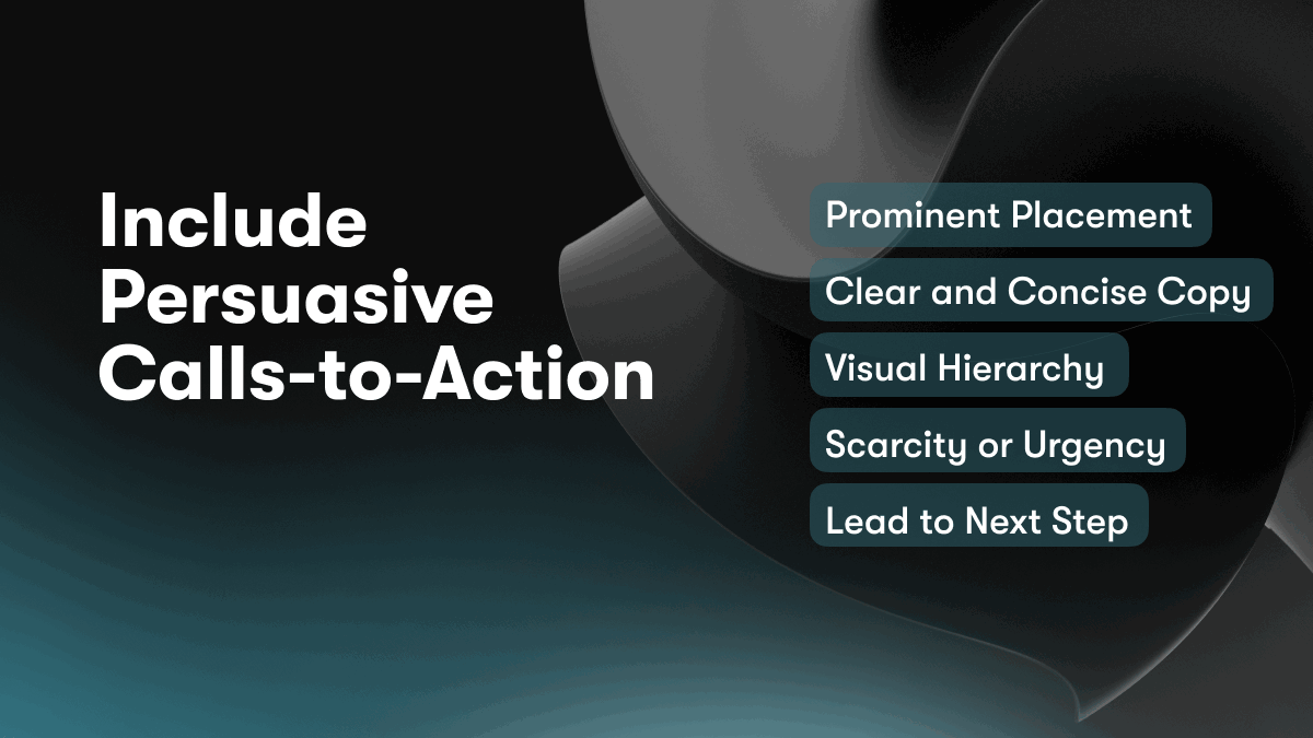
Include Persuasive Calls-to-Action
Persuasive calls-to-action (CTAs) are critical for converting visitors into customers or subscribers. On your food landing page, include clear CTAs that inspire action and drive results.
Prominent Placement
Place your main CTA prominently on the page, such as in the header or centered in the content. This could be a large button inviting visitors to “Order Now” or “Sign Up.” The CTA should stand out and be one of the first things visitors see when they land on the page.
Clear and Concise Copy
The CTA copy should be clear, concise, and action-oriented, using an imperative verb like “Order” or “Sign Up.” Explain exactly what will happen when the visitor clicks, such as “Order your meal plan now to receive 20% off your first delivery.” Keep the copy to 1 or 2 short sentences for maximum impact.
Visual Hierarchy
Use visual hierarchy to draw attention to your CTAs. You can make the buttons larger, use a contrasting color, add an icon, or place the CTA on its own line. The styling of your CTA should differentiate it from other page elements to signal its importance to visitors.
Scarcity or Urgency
You can make your CTAs even more persuasive by instilling a sense of scarcity or urgency. For example, “Order within the next 24 hours to claim your 20% discount” or “Only 5 meal plans left at this price!” When people feel they are about to miss out on a good opportunity, they are more motivated to take action.
Lead to Next Step
Finally, ensure your CTAs lead directly to the next step in the conversion process, such as a checkout page or signup form. A CTA that goes nowhere will only frustrate visitors and hurt your conversion rates. Your food landing page should have a clear path from CTA to conversion.
Following these best practices for creating persuasive calls-to-action will turn more of your food landing page visitors into happy customers. Keep experimenting with different CTAs to see what resonates most with your audience.
Optimize for Mobile to Reach More Customers
To reach the widest possible audience for your food website or landing page, it’s critical to optimize for mobile devices. According to studies, over half of all web traffic now comes from mobile phones and tablets. If your site isn't mobile-friendly, you could be missing out on connecting with a huge portion of potential customers.
To make your food site mobile-optimized:
responsive design
Use a responsive design that dynamically adapts to different screen sizes. Images, text, and buttons should be easy to see and interact with on any device. A responsive template will reformat your content to fit everything onto a small screen.
Large type and buttons
Ensure your font size, buttons, and links are large enough for people to easily tap on mobile. A minimum font size of 16px is recommended. Keep buttons at least 44px x 44px in size.
Minimal navigation
Keep your navigation simple with only the most important links and categories. A hamburger menu works well for tucking away secondary links on small screens.
Fast loading
Optimize images and compress files to improve loading speeds. People expect pages to load in 3 seconds or less on mobile. Use a CDN to quickly serve assets from a location closest to the user.
Mobile-first indexing
With Google's mobile-first indexing, the mobile version of your site is now the primary index that determines search rankings. So make sure the mobile experience is not lacking in any way. Content, URLs, and metadata should all match between desktop and mobile.
AMP compatible
For news articles and blog posts, use Google's Accelerated Mobile Pages or AMP to create lightning fast mobile pages. AMP pages load near instantly and provide an optimal reading experience on phones.
Optimizing for mobile is vital for any food website or landing page today. By following the best practices for responsive design, you'll give visitors a great experience and open your business up to more potential customers, regardless of what device they use. Focusing on mobile will help you build an effective digital presence and reach more people looking for your product or service.
A/B Test Your Landing Page to Improve Conversions
To improve the conversion rate of your food landing page, conducting A/B tests is key. A/B testing involves creating alternative versions of your page to see which one performs better. You make small changes to your page, such as rewording page sections or rearranging elements, and analyze how visitors respond.
Choose What to Test
Focus your A/B tests on elements that directly impact conversions, such as:
- Headline and page copy
- Call-to-action (CTA) buttons
- Page layout and design
- Images
- Form fields
For example, you could test two different headline options or place the CTA button in different locations on the page.
Set Up Your Test
To run an A/B test on your Unicorn Platform landing page:
- Duplicate your existing landing page. This will be version A.
- Make changes to the duplicated page. This will be version B. Changes should be minor, only altering one element at a time.
- Choose the percentage of traffic to direct to each page version. A 50/50 split is common for A/B tests.
- Run the test for at least one week to collect enough data. The longer the test runs, the more statistically significant the results will be.
- Analyze the results to determine which page version had a higher conversion rate. The version with the higher rate is the winner.
- Make the winning version your new live landing page and archive the other.
- Continue optimizing your page through additional A/B testing. Even small improvements can significantly impact your conversion rate over time.
Review and Repeat
A/B testing your landing page is an iterative process. Review your test results regularly and continue testing new alternatives to further improve conversions. Over time, you can increase conversions by double digits or more. With an optimized landing page, you'll turn more visitors into customers and grow your business.
Food Website Design FAQs: Commonly Asked Questions Answered
A stylish and effective food landing page is key to converting visitors into customers and driving sales. Here are some commonly asked questions about designing an impactful food website:
What elements should I include on my food landing page?
The essential elements to include on your food landing page are:
- High-quality food photography. Images of your dishes are critical for showcasing your offerings and enticing visitors.
- A clear headline and subheadline. Explain what you offer and your unique value proposition.
- A brief description of your restaurant or menu. Help visitors understand your concept, cuisine, and experience.
- Strong calls-to-action. Add buttons for visitors to make a reservation, order online, or find your location.
- Reviews or testimonials. Social proof builds trust and credibility. Include quotes from happy customers.
How can I make my food website more appealing?
Several design strategies can make your food website more appealing:
- Choose an attractive color palette with warm, appetizing colors like red, orange or brown.
- Use large, high-resolution food images. Close-up shots of your signature dishes work well.
- Include lifestyle images of customers enjoying your restaurant. Help visitors visualize the experience.
- Implement a clean, uncluttered design with plenty of white space. An organized layout is pleasing to the eye.
- Add enticing animations or videos on your landing page. Bring your website to life and capture attention.
- Use a readable yet stylish font that suits your brand and cuisine. Classic, simple fonts tend to work best for food websites.
What are some best practices for food website copywriting?
When writing content for your food website, keep these best practices in mind:
- Focus on benefits and experiences, not just features. Describe how you satisfy customers and the memorable moments you provide.
- Use sensory language to help visitors imagine the tastes, smells and sounds. Reference fresh, delicious and flavorful.
- Keep your tone upbeat, appetizing and hospitable. Write in a friendly, inviting way like you would welcome guests into your restaurant.
- Emphasize what makes you unique. Share your story, culinary philosophy and passion for quality ingredients or craft.
- Optimize for search engines by including relevant keywords in your page titles, headings, alt text and content. Use keywords that potential customers may search.
Following these tips will help you build an attractive and optimized food landing page that turns more visitors into loyal customers. Let your delicious dishes and hospitality shine through in an experience that leaves visitors hungry for more.
Conclusion
You now have the tools to create an eye-catching food landing page in minutes. With Unicorn Platform, you can choose from professionally designed templates, drag and drop sections to your liking, and customize everything to match your brand. Your new landing page will make a great first impression, capture leads, and convert visitors into customers. Don't delay - sign up for your free Unicorn Platform trial today and start building your stylish food landing page. Before you know it, you'll have an optimized landing page that drives real results for your business.


