You have a vision for your startup and want to share it with the world, but building a website can be complicated and time-consuming. As an entrepreneur, your time is valuable and limited. You need a simple solution to create an eye-catching landing page that conveys your unique value proposition to visitors and converts them into customers or subscribers.
Unicorn Platform provides elegant landing page templates, like the Airbnb-inspired design, that you can customize in minutes using an intuitive drag and drop interface. No coding required. Simply select a template, add your company logo and images, choose fonts and color schemes, and enter your content. Before you know it, you’ll have a professional landing page optimized for lead generation and communicating the benefits of your product or service to site visitors.
With Unicorn Platform, you can focus on growing your business instead of wrestling with web design and development. Our landing page templates and easy-to-use builder give startups a simple yet powerful solution for launching an effective online presence and reaching more customers.
If you're in the travel industry, check out our article on building a travel industry web design with Unicorn Platform to see how our platform can help you create a stunning website that showcases your brand and attracts more customers.
What Is Unicorn Platform?
Unicorn Platform is an intuitive website builder that allows you to create custom landing pages without any coding knowledge. As an easy-to-use drag and drop builder, Unicorn Platform provides pre-designed templates to get you started, along with the ability to fully customize your pages.
- What is a landing page? A landing page is a standalone web page used to convert visitors into leads or customers. Landing pages are focused on a single call-to-action like signing up for a newsletter, downloading an ebook, or purchasing a product.
- Why use a landing page builder? Building landing pages from scratch requires web design and development skills. With a landing page builder like Unicorn Platform, you can create high-converting landing pages without needing to code. You have access to mobile-responsive templates, an intuitive editor, and useful features like lead forms, countdown timers, and more.
- Key features of Unicorn Platform. Some of the essential features of Unicorn Platform include:
› Drag and drop editor - Simply drag and drop elements like text boxes, images, buttons, and more to build your page. No coding required.
› Mobile-responsive templates - Choose from professionally-designed templates optimized for mobile devices. Your landing pages will display beautifully on smartphones and tablets.
› Integrations - Connect your landing pages to email marketing services, payment processors, and CRMs. Collect leads and sell products directly on your landing pages.
› Analytics - Gain insights into how your landing pages are performing with real-time analytics on page views, conversions, and traffic sources. Optimize your pages for the best results.
› Custom domains - Use your own custom domain name for a professional brand experience. Unicorn Platform allows you to connect custom domains or purchase new domains directly in the builder.
With an intuitive interface and useful features, Unicorn Platform has everything you need to build high-converting landing pages for your business or next startup. Sign up for a free trial today and start creating!
Benefits of Using a Landing Page Builder
As a business owner, using a landing page builder for your website allows several benefits. A landing page builder gives you an easy way to create customized landing pages to effectively market your product, service, or mobile app.
- Save time. With drag and drop functionality, you can build a landing page in a fraction of the time it would take to code one from scratch. Pre-designed templates provide a starting point so you can get your page live quickly.
- Improve conversion rates. Landing pages that are purpose-built to convert visitors into leads or customers have been shown to significantly improve conversion rates over standard web pages. Landing page builders offer templates optimized for conversions as well as forms, calls-to-action, and other conversion-focused elements.
- A/B test for optimization. Many landing page builders allow you to easily set up A/B tests to optimize your landing page. You can test different headlines, copy, images, or calls-to-action to see which ones resonate most with your visitors and generate the highest conversion rates.
- Mobile-friendly. With more and more web traffic coming from mobile devices, having a mobile-optimized landing page is critical. Landing page builders automatically create pages that display well on any device with responsive designs.
- Analytics. Understand how your landing page is performing with built-in analytics. See key metrics like page views, conversion rates, and sources of traffic to optimize your page for the best results.
Using a landing page builder provides significant benefits for promoting your business online. An easy-to-use builder allows you to quickly create high-converting landing pages, A/B test different variations, gain insights with analytics, and have a responsive design for any device. With these advantages, you can focus on growing your business knowing you have an effective marketing tool to support your efforts.
Choose the Perfect Landing Page Travel Template on Unicorn Platform
To design an effective landing page for your travel website or app on Unicorn Platform, select a template that conveys the right impression for your brand and target customers. Unicorn Platform offers many professionally-designed templates to choose from.
Elegant and Minimalist
For a high-end travel brand, an elegant and minimalist template with lots of negative space, clean lines, and a neutral color scheme is ideal. The “Airbnb” and “Booking.com” templates are excellent choices, with their large, impactful photos, simple fonts, and muted colors. These signal a premium experience to visitors.
Vibrant and Fun
If targeting budget travelers or promoting an exciting destination, a vibrant and fun template is perfect. Options like “Contiki Tours” or “Topdeck Travel” feature bright accent colors, playful graphics, and an energetic feel. Engaging photos of young people enjoying an adventure bring the brand positioning to life.
Rustic and Natural
Eco-friendly travel brands and those promoting natural settings should consider a rustic and natural template. The “Outdoorsy” and “Hipcamp” templates incorporate natural wood textures, earthy colors, outdoor photos, and hand-drawn elements for an authentic feel that will resonate with the target audience.
To customize the template, simply drag and drop your own photos, update the text, choose different colors and fonts, add your logo, and make any other changes needed to reflect your unique brand. You can also start from scratch and build your own custom landing page, selecting individual sections and components to achieve your desired look and feel.
With a well-designed landing page that speaks to your target customers, you will convert more visitors into subscribers, leads, and ultimately customers. Carefully selecting a template that aligns with your brand positioning and values is the first step to success. Unicorn Platform’s easy to use drag and drop builder makes the process simple, allowing you to create a high-converting landing page in no time.
Why Use the Airbnb Landing Page Template?
The Airbnb landing page template provides several benefits for your Unicorn Platform website. By utilizing this template, you can achieve an appealing and professional design that resonates with your target audience.
Familiar and Trusted
The Airbnb brand is recognizable worldwide. Their landing page design is clean, minimalistic, and highlights beautiful images of travel destinations. By using a similar template, you can tap into the familiarity and trust that Airbnb has already established. Viewers will associate your landing page with the quality and experience of Airbnb.
Optimized for Conversions
Airbnb’s landing page is optimized to encourage viewers to book a stay. The large, stunning photos capture attention while the minimal text focuses on the most important details and a clear call-to-action. This template can help you create a landing page optimized to achieve your desired conversion, whether it is a sale, signup, or another goal.
Mobile-Friendly
With so much web traffic now coming from mobile devices, a responsive mobile-friendly landing page is essential. The Airbnb template is designed to display beautifully on any screen size. By using this template, you can rest assured that your landing page will provide an excellent experience for all visitors, regardless of how they access your site.
Customizable
While the Airbnb landing page template offers many benefits, you can still customize it to fit your unique brand and needs. You have control over colors, fonts, images, and content. Add your own logo, photos, and text to create a custom landing page that aligns with your brand identity and message. With the template as a starting point, you can design an on-brand landing page tailored for your target audience.
In summary, the Airbnb landing page template is a smart choice for creating a high-quality landing page that converts. By leveraging this template, you can build a familiar, optimized, mobile-friendly, and customizable landing page for your Unicorn Platform website. With some custom styling, you can develop a landing page that resonates with your audience and achieves your conversion goals.
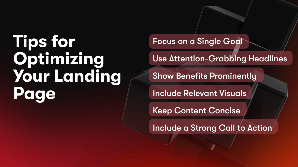
Tips for Optimizing Your Landing Page
Focus on a Single Goal
For an effective landing page, concentrate on one clear goal or conversion, such as getting visitors to sign up for a free trial or download an ebook. Do not dilute your message by including multiple goals or calls to action on the page.
Use Attention-Grabbing Headlines
Your headline should capture the visitor's interest immediately and inspire them to continue reading. Use power words like “secret,” “revolutionary,” or “amazing” to create a sense of urgency or excitement. Mention the key benefits or solutions offered to pique the reader's curiosity.
Show Benefits Prominently
Clearly state the major benefits and solutions offered within the first few sentences. Use bullet points or numbered lists to highlight the most significant advantages of your offering. Explain how you can solve the visitor's challenges or meet their needs.
Include Relevant Visuals
Include images, graphics, photos, or videos to visually reinforce your message and make the page more engaging. Any visuals used should be high quality and directly relate to your product or service. They should enhance the visitor's understanding of your key benefits and offerings.
Keep Content Concise
With limited attention spans, keep your content as concise as possible while still effectively conveying your message. Focus on the most important details and avoid unnecessary words and clutter. Use short sentences and small paragraphs to make the content easy to read quickly. Your visitors should be able to understand your offer within a few seconds of landing on the page.
Include a Strong Call to Action
Your call to action tells the visitor what to do next, such as start a free trial, sign up for a webinar or download a resource. Place your CTA prominently on the page, using a button or link that stands out. Your CTA should be compelling while remaining consistent with your overall message and goals for the landing page.
Following these tips will help you create an optimized landing page that effectively captures attention, highlights your key benefits, and inspires visitors to take action. With a focused, compelling message and strong call to action, your landing page can drive more conversions and achieve your business goals.
Adding Engaging Visuals and Multimedia
To enhance engagement and capture interest, adding visual media elements to your Unicorn Platform landing page is key.
Images
Incorporating high-quality images that are relevant to your brand or product is one of the simplest ways to make your landing page more visually compelling. Images help to quickly convey concepts and emotions, so choose photos that align with your company vision and values. For an Airbnb-style travel template, scenic destination images, photos of unique rental properties, and pictures depicting ideal target customers enjoying a vacation experience would all be fitting options.
Icons
Icons are a useful way to visually represent ideas, make information scannable, and add visual interest. Pick a cohesive icon set and incorporate icons to highlight key features, steps in a process, or different product options. Icons should be clear, simple, and aid in navigation or understanding.
Videos
Short videos, known as explainer or demo videos, are highly engaging and a dynamic way to showcase your product, demonstrate how it works, and bring your brand to life. Keep videos under 2 minutes in length, and place them prominently on your landing page, ideally above the fold so visitors see them immediately. For an Airbnb-style template, a video tour of an interesting rental property or customer testimonials discussing their stay would resonate well with visitors.
Infographics
Infographics are a compelling visual way to convey statistics, steps, timelines or comparisons. If you have data or a process that would translate well into an infographic, incorporate one into your landing page. Infographics allow visitors to understand key points at a glance. However, only include an infographic if you have information that truly benefits from being displayed this way. An infographic for the sake of having one will not add value and risks seeming unnecessary or cluttered.
Using a strategic combination of images, icons, videos, and infographics tailored to your brand and product will transform your Unicorn Platform landing page into a visually engaging customer experience. Implementing multimedia elements keeps visitors interested and helps convey important information and key selling points with impact. An eye-catching yet focused landing page that balances visuals with written content will lead to higher conversion rates and more sales.
Increasing Conversions With a Clear CTA
To increase conversions on your Unicorn Platform landing page, a clear call to action (CTA) is essential. A CTA prompts visitors to take the desired action, whether it’s signing up for a free trial, booking a demo, or purchasing your product.
Make The CTA Prominent
Place your CTA front and center on the page where visitors will see it immediately. Use a bold color and large font size to make it stand out. For an Airbnb-style template, a bright color like red, orange or teal works well.
Offer Value
Clearly communicate the value of clicking the CTA. For example, “Start your free 14-day trial” or “Book your demo now.” Explain the benefits, such as “Get started with Unicorn Platform today and build your website in just 5 minutes.” Keep your messaging positive and solution-focused.
Limit Distractions
Remove any elements on the page that could divert attention from the CTA. For an Airbnb template, keep the navigation simple with only 1 or 2 links. Remove footer links or excess images. The CTA should be the most visually striking part of the page.
Place Strategically
Position the CTA in a spot where visitors are most likely to take action, such as center page or in the right sidebar. For a travel company, right sidebar works well since visitors will be focused on images of destinations. Anchoring the CTA to the top of the content also ensures it is seen even if visitors do not scroll far down the page.
Keep Consistent
Use the same CTA wording and styling on each page of your website. This reinforces your messaging and makes it easy for visitors to take the next step from anywhere on the site. Consistency builds familiarity and trust in your brand.
Following these best practices will make your CTA as compelling and effective as possible. An optimized call to action, combined with an enticing Airbnb-style template, creates a seamless experience for visitors and boosts your conversions.
A/B Testing Your Landing Page
A/B Testing Your Landing Page
To optimize your landing page and maximize conversions, consider running A/B tests. A/B testing, also known as split testing, compares two versions of a webpage to determine which one performs better.
Set a Goal
First, determine what you want to achieve with your landing page. Do you want more email signups? More product purchases? Clearly define your goal so you can measure the effectiveness of your A/B tests.
Choose Elements to Test
You may want to test different headlines, images, button placements or content. For example, you could test:
- Headline: “Join 100,000+ users” vs. “Get started for free today”
- Hero image: People using your product vs. Product screenshots
- Call-to-action (CTA) button color: Green vs. Blue
Set Up Your Test
You’ll need an A/B testing tool to split traffic between the two page variations. Many website builders offer built-in A/B testing. You’ll also need enough traffic and time to get statistically significant results. In general, the more traffic and longer time period the better.
Analyze the Results
Look at key metrics like click-through rate, conversion rate and page views to see which version performed better. The variation that leads to more people taking your desired action, like signing up or making a purchase, is the winner.
Implement the Winning Variation
Once you have a winner, make that version your official landing page. You can continue optimizing by running additional A/B tests. Even small changes can lead to significant improvements over time.
A/B testing is a simple way to optimize your landing page and boost key metrics. By testing different elements and analyzing the results, you can create a highly-effective landing page that converts visitors into customers or subscribers. Continuous optimization and experimentation is key to success.
Landing Page FAQs: Common Questions About Unicorn Platform Answered
What is a landing page?
A landing page is a standalone web page that is designed specifically to convert visitors into leads or customers. It typically has an eye-catching design, strong call-to-action, and content focused on selling a product or service. Landing pages are used by businesses to capture leads from advertising campaigns like Google Ads or social media ads.
What is a landing page template?
A landing page template is a pre-designed layout you can use to quickly create a customized landing page for your business. Templates include the basic elements like:
- Headline
- Subheadline
- Bullet points highlighting features and benefits
- Image(s)
- Call-to-action (e.g. "Sign Up Now" or "Learn More")
- Form to capture lead information
Using a template allows you to get your landing page up and running without needing advanced technical or design skills. You can then customize the content to match your brand and messaging.
How do I customize an Airbnb landing page template?
Unicorn Platform makes it easy to customize one of our Airbnb landing page templates to fit your needs. Here are the main steps:
- Select an Airbnb landing page template from our template library. These are designed specifically for vacation rental and travel companies.
- Change the page title, headlines, subheadlines and call-to-action to match your brand voice. You can adjust text size, font, and color as needed.
- Add or swap out images to visually represent your property or location. Make sure any images are high quality and help convey the experience you want to highlight.
- Update or remove content blocks as needed. You may want to add a video, amenities list, nearby attractions, or customer reviews for example. Simply drag and drop the blocks you want.
- Connect the call-to-action to your booking system so leads go directly to your calendar. You can also have the form capture additional details like number of guests.
- Preview and test your landing page before publishing to ensure all elements are displaying properly on desktop and mobile devices. Make any final tweaks needed.
- Drive paid and organic traffic to your landing page through ads, search engine optimization, social media, and your website. Track conversions and optimize as needed.
Using Unicorn Platform, you can create a customized Airbnb landing page in a matter of minutes. Let us know if you have any other questions!
Conclusion
As you’ve seen, the Airbnb landing page template offers an engaging design that is optimized to capture visitor interest and encourage them to take action. With eye-catching visuals, a simple yet impactful layout, and clear calls-to-action, this template provides an ideal starting point for promoting your travel startup or mobile app. Using a service like Unicorn Platform to customize and publish the page, you can have an effective landing page up and running in practically no time. So why wait? Choose a template, personalize it to match your brand, and start converting more visitors into customers and clients today. The journey to success begins with a single step. Take that first step now with Unicorn Platform.
