You've spent months planning an amazing event and now it's time to spread the word. But in today's digital age, simply creating a Facebook event or sending out a mass email isn't enough. You need an eye-catching landing page to capture people's attention and get them excited to attend. The good news is, you don't need to be a designer or developer to build a great landing page. With a few simple tips, you can create an event page that turns visitors into eager attendees. We've rounded up 5 of the most unique and effective event landing pages out there to spark your creativity. Whether you're organizing a conference, fundraiser, or networking event, you'll find plenty of inspiration from these examples. Read on to discover how to make your event the hottest ticket in town with a landing page that sells.
What Is an Event Landing Page?
So, what exactly is an event landing page? Simply put, it's a web page dedicated specifically to your event. It's where attendees will go to learn more about your event and register or buy tickets.
- Why do you need one? An event landing page helps you:
Generate leads and build hype. By providing details about your event, you'll get people interested and excited to attend.
Increase conversions. A dedicated page focused on your event makes it easy for people to sign up or purchase tickets right then and there.
Stand out. A custom landing page helps your event seem more professional and put-together compared to just a generic event listing.
- What should you include? The key elements of a great event landing page are:
An eye-catching headline and visuals. Use images and multimedia to showcase the experience of your event.
A clear event summary. Briefly describe your event, including the date, time, location, and purpose. Mention the types of attendees and activities or sessions.
Speaker or performer bios. Introduce the people involved to build credibility and excitement.
A registration or ticketing form. Make it simple for people to sign up or buy tickets right from your landing page.
FAQs. Answer common questions about the event upfront to address any concerns attendees may have.
Social proof. Share reviews, testimonials, or quotes from past attendees to build trust in your event.
Contact information. Provide an email, phone number, or contact form in case people have additional questions.
A strong call-to-action. Use action-oriented language and buttons to encourage people to register or buy tickets for your event.
With the right elements in place, an event landing page can be a game-changer for promoting your event and attracting more attendees. Why not give it a try?
Virtual developer conference: WPEngine Decode
WPEngine’s Decode virtual developer conference landing page is a great example of an effective yet simple design. As soon as you visit the page, the clever heading lets you know this event is aimed at developers.
Decode is a free virtual conference for WordPress developers. Past events have featured speakers from major tech companies discussing things like:
- Headless WordPress
- JavaScript frameworks
- Site performance
- Accessibility
The page outlines what you can expect from the event, like live Q&A, networking opportunities, and swag. As you scroll, you’ll see snapshots from previous Decode conferences so you know what you’re in for.
Registration is easy through the prominent call-to-action button. Once registered, you’ll receive updates and reminders about the event. The simple but bold design, along with plenty of details about speakers, schedule, and topics, gives developers everything they need to decide if they want to attend.
Overall, this landing page effectively achieves its goal by:
- Targeting the specific audience of WordPress developers
- Explaining the purpose and topics covered at Decode
- Highlighting past events and speakers
- Making registration simple with a prominent call-to-action button
- Using visuals to give attendees a sense of what to expect
The combination of a specialized topic, strong visuals, and clear event details results in a landing page that should capture the interest of any WordPress developer. With a design this straightforward yet compelling, it’s no wonder WPEngine’s Decode event is so popular.
Keeping It Simple: EventBrite
EventBrite is a popular event management platform, but they also have some great examples of simple yet effective event landing pages. Their pages focus on clean design and minimal clutter to put the important details front and center.
Take EventBrite’s “Startup Grind” event page. The headline and subhead give you the basics at a glance—what the event is, when and where it’s happening. A large, eye-catching photo shows the type of event and intended audience.
- The page is split into sections for “Details,” “Schedule,” “Speakers,” and “Venue Info” so visitors can easily find what they need.
- A prominent call-to-action button (“Register Now”) stands out, making it easy for people to buy tickets.
- Short paragraphs with bullet points describe the event highlights and speaker bios without overwhelming the reader.
This minimal design works because it focuses on what really matters to attendees. The page is scannable, with a logical layout and hierarchy to guide people to the most important details and help them register as quickly as possible.
Other events can benefit from this pared-down approach:
- Conferences: Highlight keynote speakers, schedules, and venue. Keep descriptions brief and bulleted.
- Networking events: Focus on the types of attendees and companies, along with logistical info. Emphasize the opportunities to connect.
- Fundraisers: Spotlight the cause or charity, key activities or entertainment, and how people can donate or buy tickets. Keep the design clean to put the focus on the purpose.
- Product launches: Feature images of the product, a quick explainer of key features or specs, and how to buy or preorder. Minimize distractions.
An uncluttered, user-friendly landing page like EventBrite’s Startup Grind example is a great model for any event. Keep it simple but compelling, and your attendees will thank you.
Bold and Vibrant: Hubspot
Hubspot’s landing page for their annual INBOUND event is bold, colorful and eye-catching. The bright orange and teal color scheme is vibrant and energetic, perfect for an event focused on marketing and sales.
As soon as you land on the page, you’re greeted by a large hero image featuring photos from their previous events. This gives you a glimpse into the experience you can expect at INBOUND. Below the fold, Hubspot uses emotive copy and social proof to sell the value of the event. Phrases like “Learn from the best” and “Connect with your tribe” tap into the desires of their target audience.
Customer testimonials and quotes from past attendees help build trust and credibility. Stats like “21,000 attendees” and “300+ sessions” demonstrate the scale and opportunities the event provides. For those still on the fence, Hubspot offers a 100% money-back guarantee to alleviate any remaining doubts.
- Vibrant color scheme that matches the energy of the event
- Hero image provides social proof of the experience
- Emotive and benefit-focused copy
- Testimonials, quotes and stats build credibility
- 100% money-back guarantee reduces risk for potential attendees
The page is also highly scannable, with clear section headings, bulleted lists, and short blocks of text. The prominent call-to-action buttons make it easy to register or buy tickets. Overall, Hubspot’s INBOUND landing page is a stellar example of an impactful event marketing page. The vibrant design, social proof, and persuasive copy would compel any marketer or salesperson to attend.
Timeless and Professional: WeWork
Simple Yet Sophisticated
WeWork’s event landing page is a perfect example of a simple yet sophisticated design. The minimalist page focuses on clean typography and a monochromatic color scheme of black, white and gray. A large hero image of a WeWork event space takes up the top half of the page, giving visitors a preview of the stylish venue.
- The page copy is concise but compelling. A bold headline invites you to “Host Your Next Event at WeWork.” Two short paragraphs highlight WeWork’s global locations, flexible spaces, and hospitality services.
- A prominent call-to-action button stands out in bright red, encouraging visitors to “Book a Tour.” When you click the CTA, a contact form pops up to schedule a visit.
- The page also features logos of well-known WeWork clients like Microsoft, Adobe and Amazon at the bottom, building social proof and credibility.
- Overall, the minimal design and smart use of empty space give the page a sophisticated vibe while still being straightforward and user-friendly. For an event company, this kind of simple, contemporary and professional image is ideal.
WeWork’s event landing page demonstrates that an uncluttered, minimalist design can be remarkably effective. By focusing on high-quality images, clean typography, and concise copy, they’ve created a page that looks polished yet uncomplicated. For your own event landing page, aim for a straightforward design that matches your brand image. Keep the layout uncrowded, choose a minimal color palette, and make sure your messaging is clear and compelling. A contemporary, minimalist style appeals to a wide audience and gives a professional impression. With a few simple touches, you can design an event landing page that is as sophisticated as it is conversion-optimized.
Interactive and Engaging: Splash
Splash created an interactive landing page for their annual developer conference that was highly engaging for attendees. The page featured:
- An animated background with code snippets and tech terms floating by to set the mood. This eye-catching animation made the page dynamic and interesting.
- A countdown clock to build excitement for the event. The clock also showed how many days, hours and minutes were left until the conference kicked off. This sense of urgency compelled visitors to register right away.
- Videos of past attendees sharing their experiences. These social proof testimonials built trust in the event and highlighted the benefits of attending.
- An interactive floor plan where visitors could explore the venue layout and see all the areas of the conference. This experience allowed attendees to visualize what the event would be like and get a sneak peek of everything it had to offer.
- Real-time updates from their social media feeds. Splash embedded live tweets, Instagram posts and Facebook updates related to the conference. This feature made the page feel alive and gave a glimpse into the active community surrounding the event.
- A registration form front and center on the page. With all the interactive elements capturing visitors’ attention, Splash made it extremely easy to sign up for the conference right then and there.
The Splash landing page is a prime example of an interactive design that engages visitors and compels them to take action. By making the page dynamic, social, and experiential, Splash created an event website that was hard to leave. The countdown clock, videos, floor plan, and real-time social updates all worked together to excite attendees and drive registrations.
The Importance of Visuals in Landing Pages
Visuals Speak Volumes
When creating an event landing page, visuals are key. People are visual creatures, so including eye-catching and engaging images, graphics, icons and videos will make your page much more compelling and help to quickly convey important information.
- Images of your event venue, speakers, attendees, etc. help visitors visualize what your event will be like and build excitement. Use high quality, professional photos that capture the energy and experience of your event.
- Infographics are an easy way to represent data, statistics, schedules, processes or timelines in an visually interesting format. They make information quick to understand and shareable on social media.
- Icons can be used to draw attention to and visually represent key points, features or sections on your page. They add visual interest and help with navigation and highlighting important details.
- Video is one of the most engaging types of content. Including a short video on your landing page that previews your event can be very persuasive. It allows people to see and hear what they can expect from attending, building a personal connection.
- Graphic elements like badges, buttons, dividers, etc. help to break up sections, draw attention and guide visitors through the page. They add visual cohesion and help the page flow in an organized, easy-to-follow manner.
An event landing page without visuals is dull, hard to engage with and not very memorable or shareable. Including a variety of visual content will bring your page to life, capture interest, and convince more people your event is worth attending. The importance of visuals in landing page design cannot be overstated. They are essential for creating an experience that inspires action.
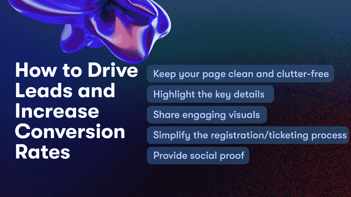
How to Drive Leads and Increase Conversion Rates
To drive more leads and boost conversion rates on your event landing page, focus on creating a simple yet compelling user experience.
Keep your page clean and clutter-free
A simple, uncluttered page is easier to navigate and more inviting. Remove any unnecessary elements and keep your content concise. Use plenty of white space to make the page appear open and airy. A clean design will make a great first impression on visitors.
Highlight the key details
Visitors want to know the essential information right away - things like the event name, date, location, and how to register or purchase tickets. Feature this prominently at the top of your page, using eye-catching headlines and buttons. You can also include a countdown timer to create a sense of urgency.
Share engaging visuals
Visuals are highly effective at capturing interest and conveying information. Include photos from previous events, images of the venue or location, graphics highlighting key activities or features, and videos if possible. But don’t overcrowd the page. Choose high-quality, relevant visuals and give them plenty of space.
Simplify the registration/ticketing process
The easier you make it for visitors to register or buy tickets, the more likely they are to convert. Have a simple contact form right on the landing page where people can enter their information. Or link to an easy-to-use ticketing/registration page. The fewer steps required, the better. Offer guest checkout and social login options as well.
Provide social proof
Build trust and credibility by including testimonials, reviews, media mentions, sponsor logos, and sharing the event on social media. People want to know that others value and recommend the event. Quotes, ratings, and shares from influential voices in your industry or community are especially persuasive.
By focusing on a clean design, highlighting key details, using visuals effectively, simplifying the registration process, and providing social proof, you can create an event landing page that drives more leads and boosts your conversion rates. A simple yet compelling page will make a memorable first impression and motivate visitors to take action.
Using Video on Your Event Landing Page
Video Brings Your Event to Life
Nothing quite captures the energy and excitement of an event like video. Adding video to your event landing page is a great way to give potential attendees a taste of what your event will be like.
A short video highlighting last year’s event is perfect for showing what people can expect. Capture clips of speakers, activities, entertainment, attendees networking and having a great time. Keep the video under 2 minutes for the best impact without overloading visitors. If you're looking for a convenient way to edit your event footage, consider using a video editor online.
Live streaming parts of your event is another option if you have the capabilities. Stream keynotes, panel discussions or other highlights to build FOMO (fear of missing out) and encourage people to buy tickets to attend in person next year.
Interviews and Testimonials from Past Attendees
Hearing directly from people who have attended your event in the past is very persuasive. Film short interview clips or testimonials from previous attendees talking about their experience at the event. Ask them to discuss their favorite parts of the event, what they learned or key takeaways, and why others in the industry should attend.
A Personal Welcome from the Organizer
If you’re the organizer or host of the event, recording a quick welcome video for the landing page is a great way to make a personal connection with visitors. Welcome them to the page, give an overview of what they can expect from the event, and extend an invitation for them to join you for what is sure to be an amazing experience. Your enthusiasm for the event will shine through, and visitors will appreciate the personal touch.
Using video on your event landing page, whether through highlights from past events, live streaming, attendee testimonials or a welcome from the organizer, is a fantastic way to bring your event to life for visitors. Video, combined with a well-designed landing page and strong call-to-action, will convert more visitors into excited attendees for your event.
-min-min-hran6.png)
How Do I Create an Event Landing Page using Unicorn Platform?
Creating an event landing page with Unicorn Platform is simple and intuitive. Here are the basic steps to get started:
Choose a Template
Unicorn Platform offers beautiful pre-made templates for event landing pages that are optimized for conversion. Select a template that matches your event’s theme and branding. You can easily customize any template to suit your needs.
Add Your Content
Now it’s time to add your own content to the page. Include details about your event like the date, location, schedule, speakers, and activities. Share photos and videos to give visitors a sense of what to expect.
- Write an attention-grabbing headline and event description to capture interest.
- Include a prominent call-to-action like “Register Now” or “Get Tickets” so people know exactly what to do.
- Feature logos of sponsors or partners to build credibility.
- Add social sharing buttons so people can spread the word about your event.
Set Up Your Email Marketing
Connect your email service to automatically capture leads from your landing page. Offer an incentive like a discount or freebie in exchange for people signing up to your email list. Build excitement for your event and engage with attendees by sending a series of emails leading up to the event.
Track and Optimize
Use Unicorn Platform’s analytics to see how people are interacting with your landing page. Look at metrics like page views, conversion rates, and click-through rates. Make changes to improve performance, such as:
- Testing different headlines, images, or calls-to-action.
- Highlighting key details or testimonials.
- Simplifying the page layout or content.
- Running an A/B test to compare two different versions of the page.
Continuously optimizing your event landing page will help you get the best results and highest turnout for your event. With some time and testing, you'll have a high-converting landing page and a successful event!
Conclusion
So there you have it, five simple yet unique event landing page examples to inspire your own design. The key is to keep things clean and uncluttered while highlighting the key details of your event like the date, location, speakers, schedule, and call-to-action. A great landing page should capture the excitement and experience of your event to motivate people to sign up or buy tickets. With some creative thinking, you can craft an event page that is bold, memorable, and effective at driving conversions. What are you waiting for? Get out there and start promoting your event in a whole new way. Your attendees and sponsors will thank you for it.
